UXOcean Agency
UXOcean is a small design agency I co-founded. I led the full website design and build — brand positioning, page structure, responsive layouts, and the Insights publication — shipping a confident, editorial-feeling site the non-technical team can actually maintain.
- Year
- 2025
- Role
- Co-founder & Designer
- Tools
- Figma · Framer
- Link
- uxocean.agency
Overview
A flagship site for a small agency that had to do three things at once: introduce us to strangers, prove competence to prospects, and give our Insights publication a credible home.
UXOcean is a boutique UX and UI studio I co-founded. I was responsible for the whole web presence — brand positioning, page structure, copy alongside UI, and every responsive breakpoint. The scope was "everything a first-time visitor sees" across desktop, tablet and mobile.
The challenge
Agency sites tend to fail in one of two directions — too flashy (novelty visuals that distract from the work) or too generic (interchangeable templates that prove nothing). We needed a site that felt confident without being loud and that made competence obvious in the first scroll.
The team is small and distributed. Whatever I built had to be editable by a non-technical co-founder without me being the bottleneck every time a sentence needed changing.
Approach
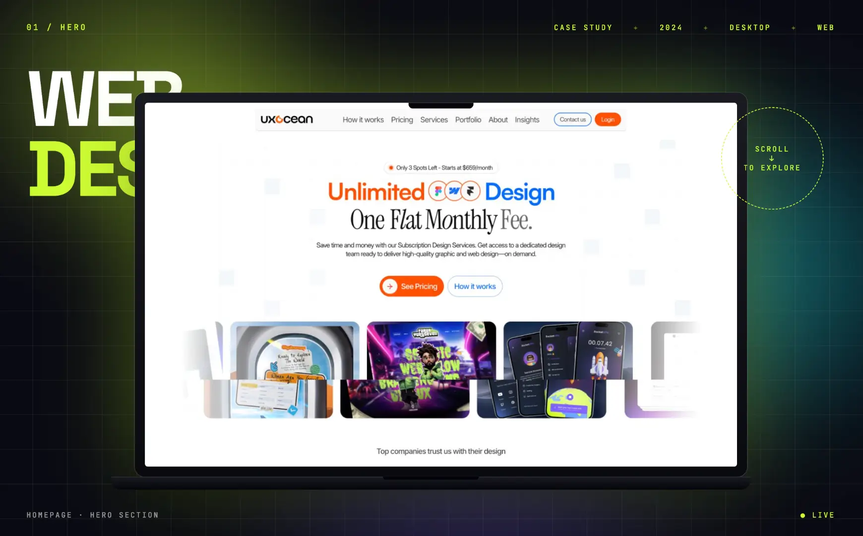
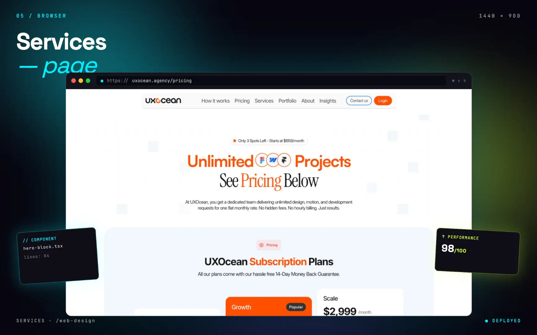
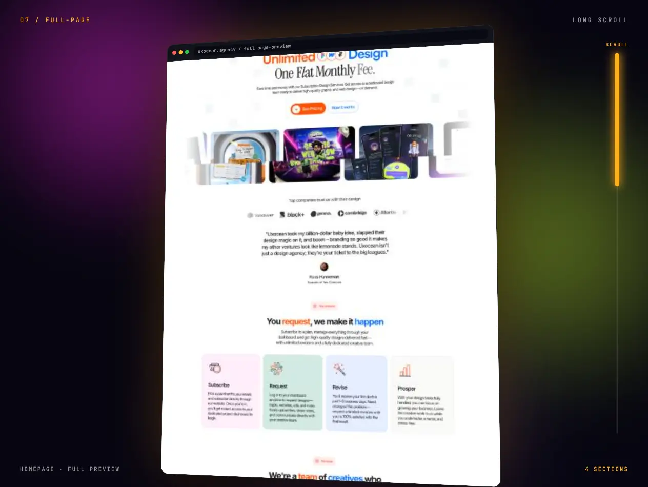
I started with typography and spacing — not visual direction. A warm editorial palette, a confident serif display, and a three-section narrative (who we are → how we work → what it costs) so the message lands in a single vertical scroll.
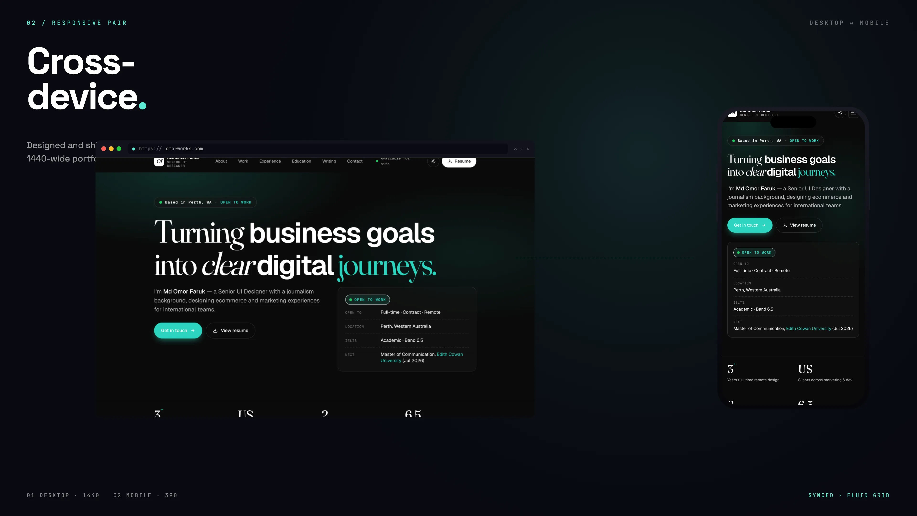
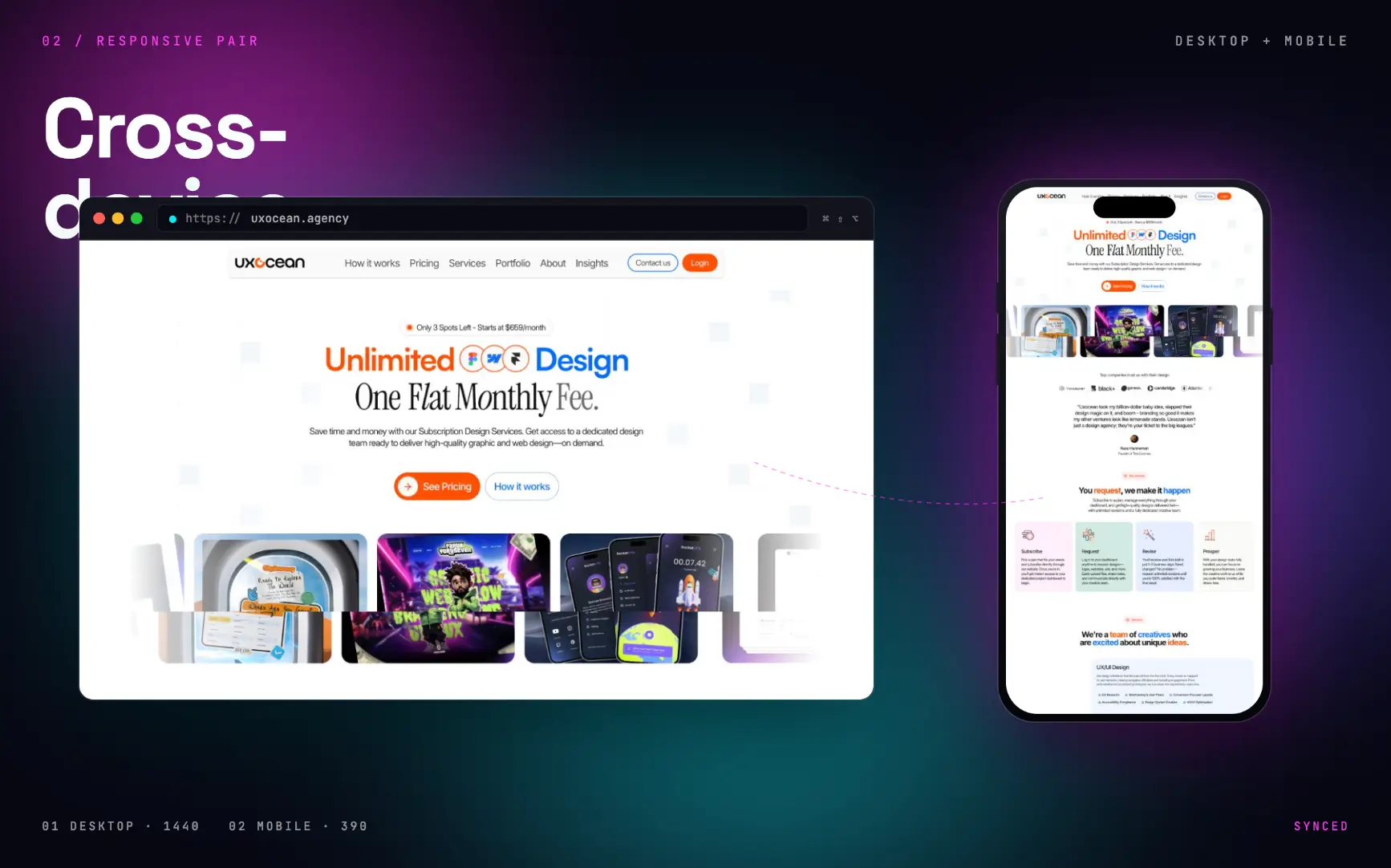
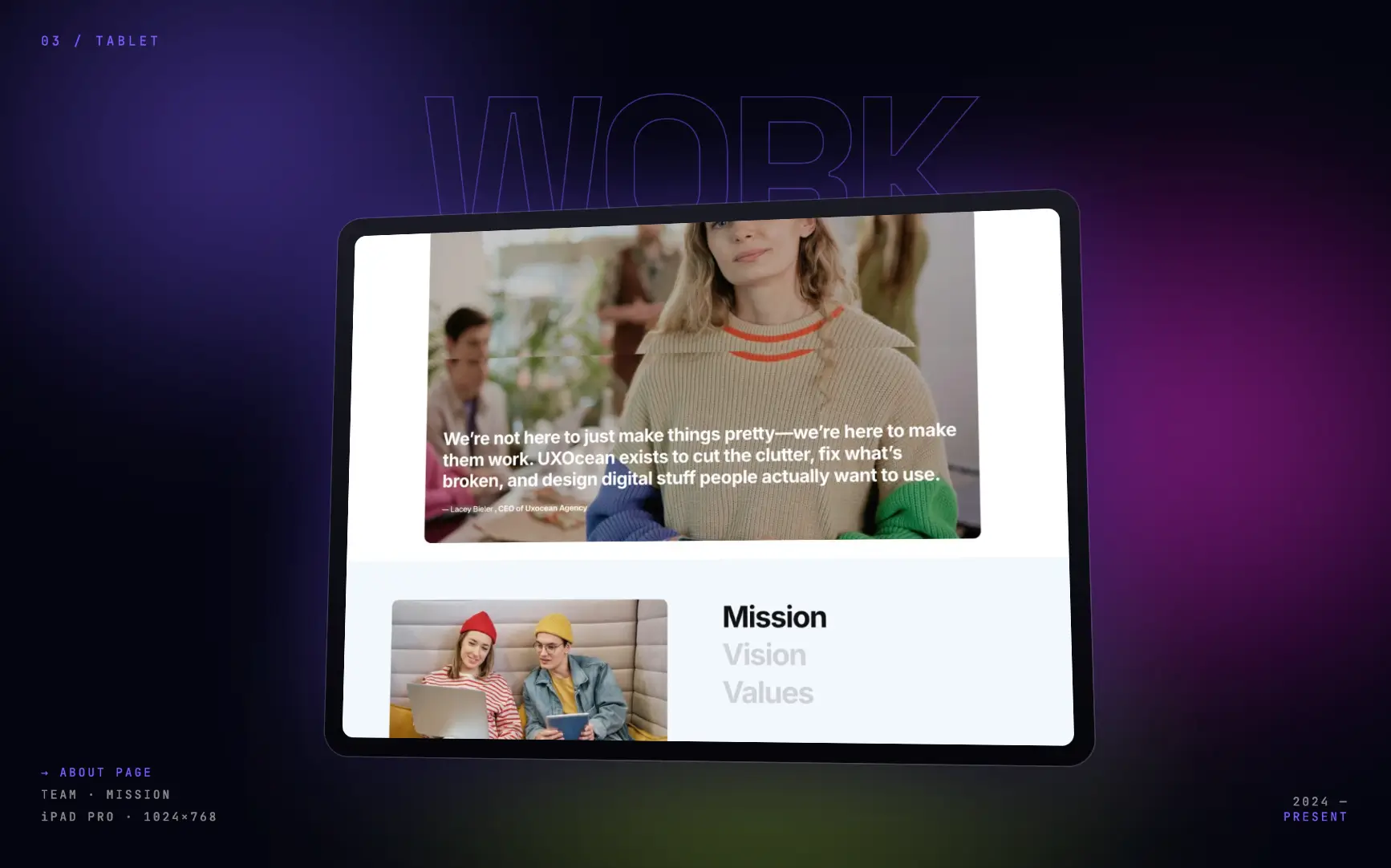
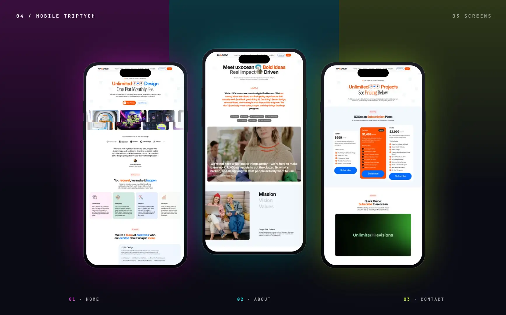
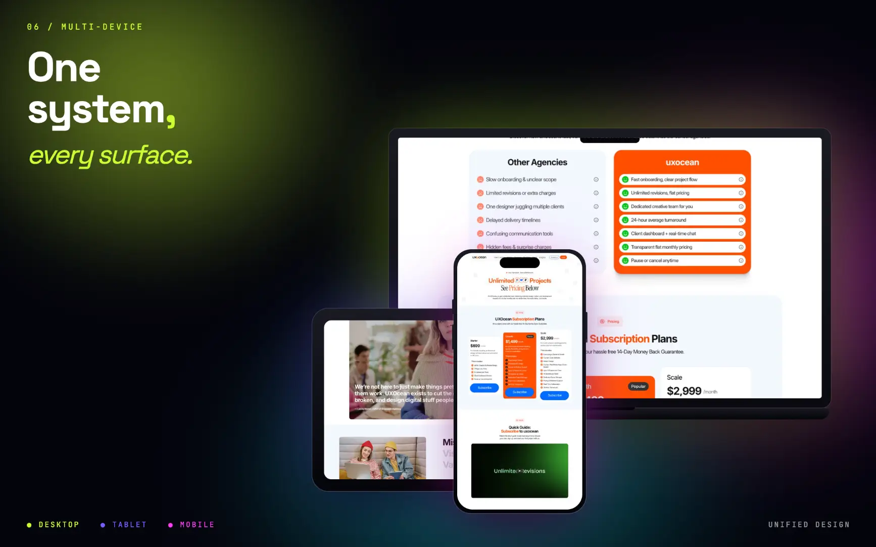
Desktop, tablet and mobile were designed in parallel rather than adapted later. Every section has an intentional layout at every breakpoint — the cross-device and desktop/tablet/mobile comps in the gallery show that parity.
Built in Framer so the team could update copy and images via a visual editor. A full-page scroll experience with sticky section cues pulls readers through instead of fatiguing them.
- Homepage — hero statement, capability cards, and a short teaser of recent work.
- Work section — selected case studies that load fast and read cleanly on any screen.
- Pricing — transparent ranges and engagement model, so conversations start with scope.
Outcome
Shipped the site in under a month of focused work, copy and design finalised together rather than sequentially.
First inbound client enquiry landed within two weeks of going live, referencing the pricing section directly — which meant the conversation started with scope rather than curiosity.
Responsive parity at launch: desktop, tablet and mobile all tested, shipped and maintained by the non-designer co-founder after handoff.
Learnings
Writing copy and designing layout together — rather than design first, copy later — saved weeks and produced better work. The voice becomes another design token instead of an afterthought.
A small team with no dedicated dev needs an editing tool they actually enjoy using. Framer wasn't the prettiest option, but it was the one my co-founder could open, change a line, and publish — and that unlocked more value than any single visual decision.