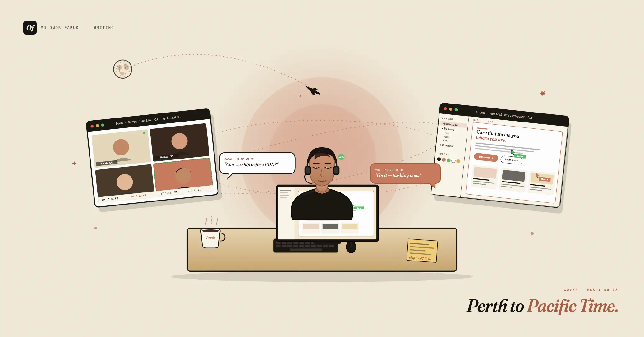
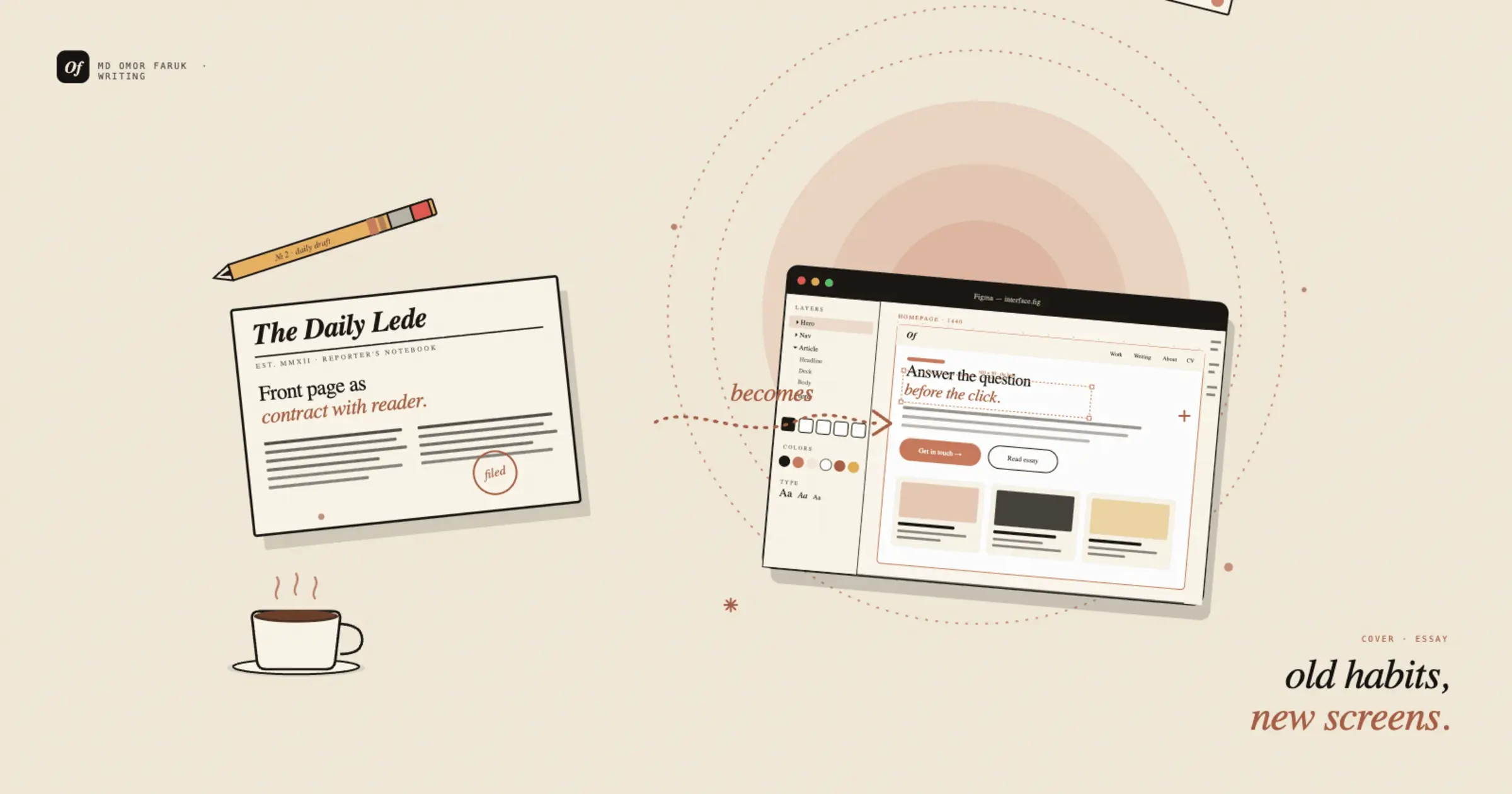
How journalism training changed the way I design interfaces
Why leading with the story — not the wireframe — produces clearer products.
Good interface design is often described as problem-solving, but journalism taught me to see it first as communication. Long before I thought about spacing systems, conversion flows, or design patterns, I was learning how to identify what matters, who it matters to, and how to present it clearly under pressure. That training still shapes every screen I make.
When I studied journalism, I was taught to respect the reader’s time. A good article does not wander. It earns attention quickly, establishes trust early, and gives people a reason to keep going. Years later, when I began designing interfaces, I realized the same rule applies to products. Users arrive with limited patience, partial context, and a question in mind. The interface either helps them move forward, or it makes them work too hard.
That shift changed the way I design. I stopped thinking of design as arranging elements on a page and started thinking of it as structuring meaning. A homepage became a front page. A call to action became a headline decision. Navigation became a promise about what kind of story the product was telling.
The lede problem
In journalism, the lede does heavy lifting. It tells you why this story matters and why it matters now. In interface design, the first screen has to do something similar. It should answer a few silent questions almost immediately: Where am I? What is this? Why should I care? What can I do next?
That sounds obvious, but many interfaces still bury the point. They lead with decoration instead of direction. They try to impress before they explain. Journalism trained me to notice that failure quickly.
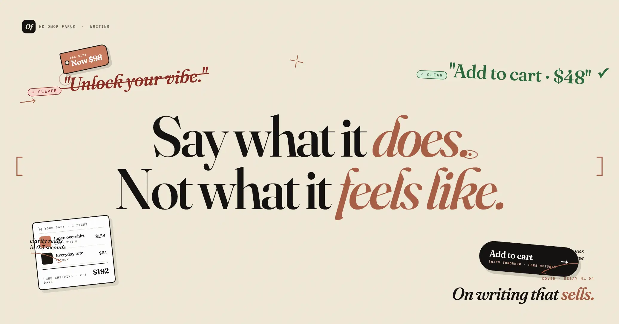
When I look at a landing page now, I ask the same questions I would ask while editing an article draft: What is the main point? Is it visible soon enough? Is there a stronger first sentence? What has been left vague? The goal is not to make a screen more “beautiful” in the abstract. The goal is to make the message harder to misunderstand.
“A strong interface, like a strong opening paragraph, reduces uncertainty before it asks for action.”
That mindset has been especially useful in conversion-focused work. Users do not need a clever riddle. They need orientation. They need confidence. Journalism taught me that clarity is not the enemy of sophistication. Often, it is the proof of it.
Hierarchy is a sentence
One of the most valuable habits journalism gave me is sensitivity to sequence. In writing, the order of information shapes understanding. Put the wrong detail first, and the entire meaning shifts. Bury context too low, and the audience feels lost. Interface hierarchy works the same way.
A page is not just a collection of blocks. It is a reading experience. The eye moves through it in an order, and that order creates meaning. Headline, subheading, visual, proof point, action: together they form a sentence the user reads without necessarily noticing.
That is why I care so much about hierarchy. Not because it is a design rule to follow, but because it is how interfaces speak. Size creates emphasis. Spacing creates rhythm. Contrast creates priority. Every layout decision answers a journalistic question: what should the audience understand first?
Journalism also made me suspicious of noise. In writing, every unnecessary sentence weakens the piece. In design, every unnecessary card, icon, label, or animation competes with the actual point. Editing matters in both disciplines.
- A strong headline should do the job of three weak ones.
- Supporting text should add context, not repeat the obvious.
- Visual emphasis should reflect importance, not personal preference.
That discipline has improved my design process more than any trend report ever could.
User research feels a lot like reporting
Another reason journalism continues to influence my design work is that both fields depend on listening well. Reporters are trained to ask better questions, notice contradictions, and separate assumptions from evidence. Good user research asks for the same skills.
When I interview users, I do not just look for feature requests. I listen for vocabulary, hesitation, frustration, and emotional weight. I pay attention to what people say first and what they only admit after a follow-up. Journalism taught me that people rarely hand you the full truth in a perfectly organized quote. You have to build understanding patiently.
That has made me better at identifying the real problem behind the visible one. A user might say a dashboard is confusing, but the deeper issue may be missing context. They might say checkout feels long, but what they really mean is they do not trust what happens after payment. Interfaces improve when designers learn to hear beyond surface complaints.
Credibility is a design material
Journalism also made me care deeply about trust. In media, credibility is fragile. It is built through precision, transparency, and consistency. Interfaces work the same way. Users notice when labels are unclear, when buttons overpromise, when error messages hide responsibility, or when important information appears too late.
Trust is not only a brand value. It is a product decision. It lives in the microcopy, the confirmation states, the empty states, and the way a form explains itself before something goes wrong. A trustworthy interface does not merely function. It tells the truth clearly.
That is one reason I have become more interested in content design over time. Journalism made me believe that words are not decoration added after the layout is done. They are part of the interface itself. A product with weak language usually has weak thinking somewhere underneath.
Designing for scanning, not just looking
Journalism assumes that many readers scan before they commit. Interface design should assume the same. Most users do not arrive ready to study a page in detail. They glance, judge, and move. That does not make them careless. It makes them busy.
Because of that, I try to design for quick comprehension first and deeper engagement second. This means writing clearer headings, simplifying decision points, and making structure visible without forcing effort. If the interface only works when someone reads every word carefully, it probably does not work well enough.
Journalism taught me that attention is earned in layers. You start with the essential, then reward curiosity. Good interfaces do the same.
What stayed with me
I did not leave journalism behind when I moved into design. I carried its habits with me. I still think about audience before expression. I still believe the first few seconds matter disproportionately. I still treat structure as meaning, not ornament.
Most importantly, journalism taught me that communication is an ethical act. What you emphasize, what you omit, what you clarify, and what you make easy to find all affect people’s decisions. Interfaces are no different. They guide behavior. They shape confidence. They influence understanding.
That is why journalism training changed the way I design interfaces. It made me less interested in making screens that simply look polished, and more interested in making products that communicate with care. For me, the best interface work still begins the same way a strong piece of reporting does: with respect for the audience, a commitment to clarity, and a sharp sense of what matters most.