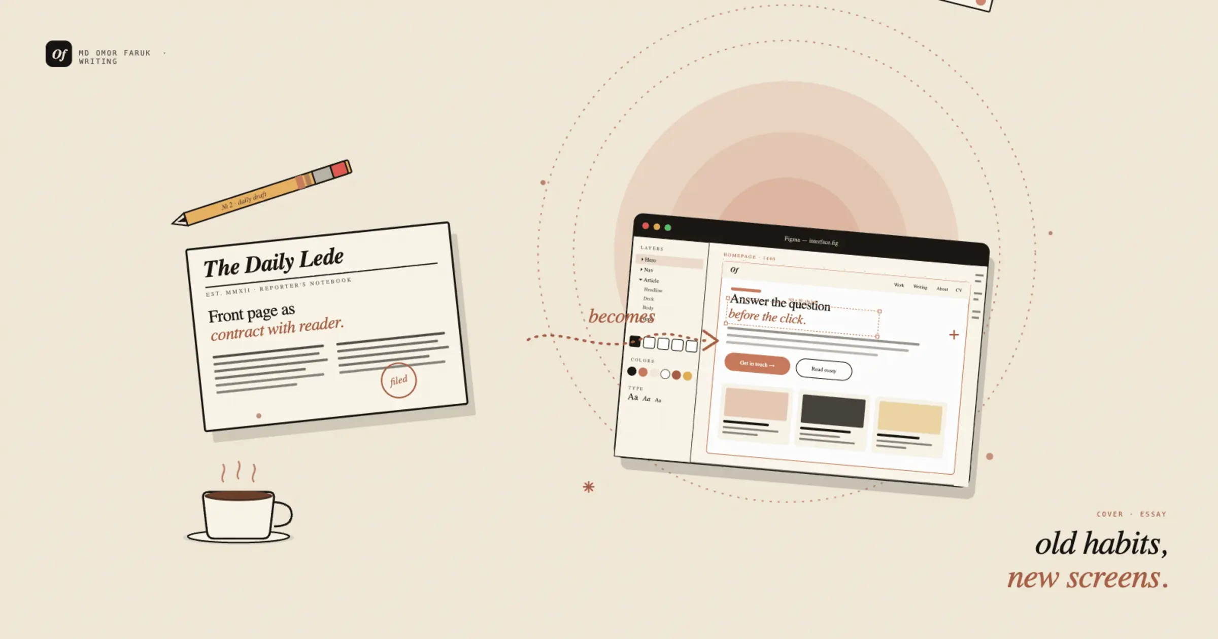
Writing UX copy for ecommerce: clarity beats cleverness
Short words, specific promises, and why the checkout is the worst place to get poetic.
In ecommerce, words do not simply decorate a design. They make decisions easier or harder. A headline can reduce hesitation. A button label can lower friction. A return policy sentence can build trust faster than a polished animation ever could. That is why I have become increasingly skeptical of clever copy in product experiences. Cleverness gets attention. Clarity gets action.
This does not mean ecommerce copy should be dull. It means its first responsibility is to help people understand what is happening, what they are choosing, and what happens next. When users are browsing products, comparing prices, checking shipping details, or deciding whether to trust a checkout flow, they are not looking for a witty line to admire. They are looking for confidence.
That is the lesson I keep coming back to: in UX copy for ecommerce, clarity beats cleverness almost every time.
The cost of sounding smart
Clever copy is tempting because it feels memorable. It can make a brand sound modern, playful, or distinct. And in some marketing contexts, that can be useful. But ecommerce is full of moments where users need plain language more than personality.
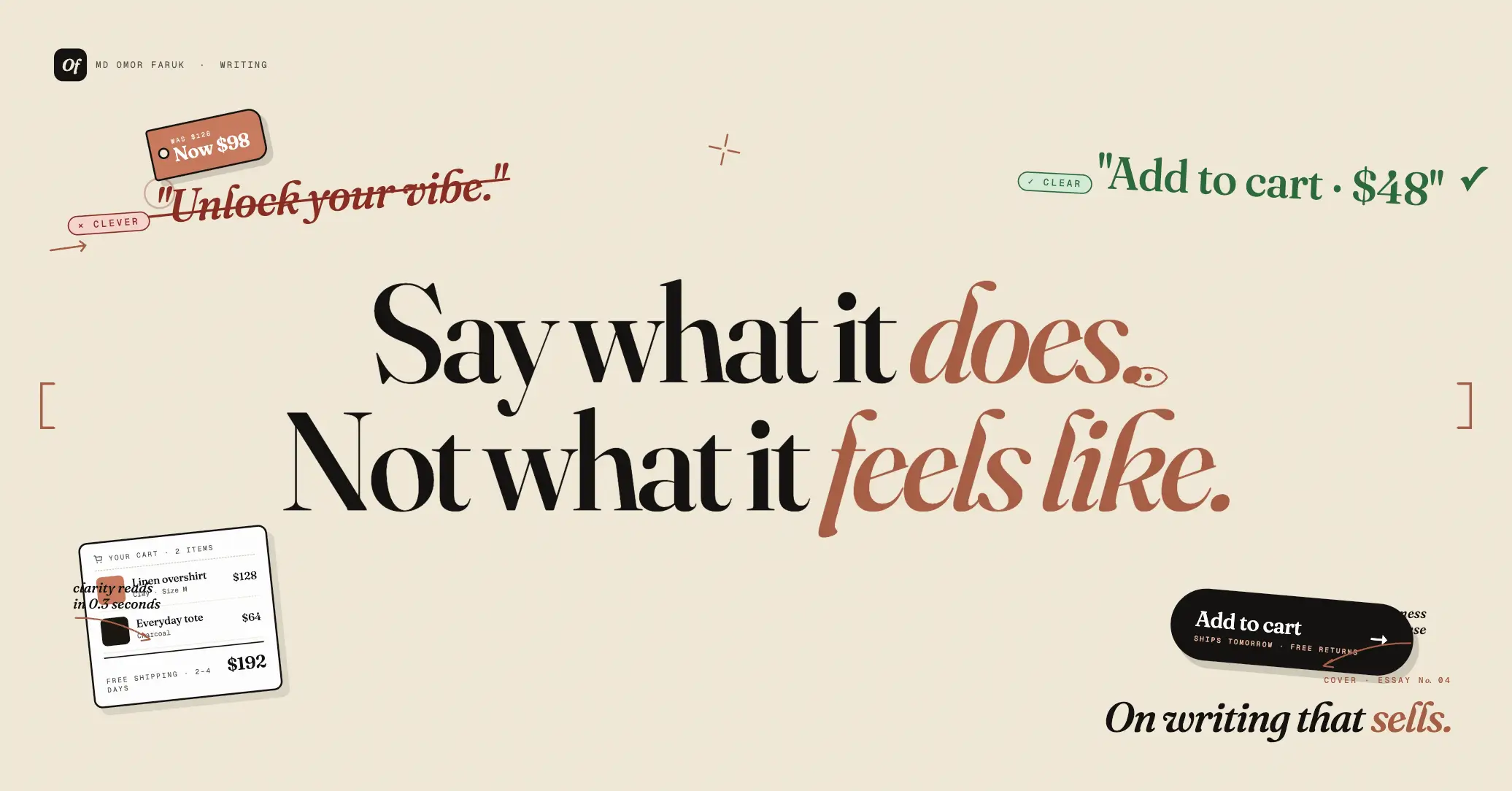
A vague button label like “Let’s do this” may sound fun, but it is weaker than “Add to cart” or “Continue to checkout.” A playful empty-state message may seem charming, but if it does not explain what the user should do next, it becomes another small obstacle.
The problem is not creativity itself. The problem is ambiguity. Clever copy often asks the user to pause and interpret. Good UX copy removes that burden.
“The best ecommerce copy does not make the user admire the writing. It helps them keep moving.”
That is especially important on product pages and in checkout flows, where every unclear phrase adds cognitive load. Users are already evaluating product fit, price, delivery time, payment safety, and return conditions. They should not also have to decode the interface.
Clarity builds trust
Ecommerce depends on trust more than many teams admit. A customer is being asked to believe product claims, enter personal information, share payment details, and wait for something they cannot touch yet. In that environment, language matters a great deal.
Clear copy signals competence. It suggests the business knows what it is doing. It reduces the feeling that something important may be hidden in vague phrasing.
This is why small details matter so much:
- “Free delivery on orders over $50” is stronger than “Delivery perks available.”
- “30-day returns” is stronger than “Shop with confidence.”
- “Ships in 2–3 business days” is stronger than “Fast shipping.”
The second versions may sound more branded, but the first versions answer real questions. And answering real questions is one of the fastest ways to increase trust.
Buttons should say what happens next
One of the clearest places where cleverness causes problems is in CTA copy. In ecommerce, buttons are action labels, not miniature slogans. Users should know what will happen when they click.
“Buy now,” “Add to cart,” “Apply discount,” “Track order,” and “Save for later” work because they are explicit. They reduce uncertainty. Compare that with buttons that try too hard to sound playful or emotionally persuasive. Those often create a tiny moment of confusion, and tiny confusion adds up quickly across a journey.
A button is not the place to perform personality at the expense of meaning. Personality can still exist in tone, but the action should stay obvious.
Product pages need answers, not adjectives
Another trap in ecommerce copy is relying too heavily on hype words. Many product descriptions are full of praise and very light on information. Words like “premium,” “elevated,” “timeless,” or “game-changing” may sound impressive, but on their own they do not help the customer decide.
What users often need is simpler:
What is this product made of? How does it fit? How large is it? Who is it for? What problem does it solve? How fast can I get it? Can I return it?
A good product page does not avoid brand voice, but it makes sure useful detail comes first. Description should support decision-making, not just mood-setting.
Microcopy matters most when users feel uncertain
The biggest value of UX copy often appears in the smallest places: error messages, form hints, delivery notices, inventory labels, and checkout confirmations. These are the moments where users are most likely to hesitate.
A weak error message like “Something went wrong” creates frustration. A clear one like “Your card was declined. Please try another payment method or contact your bank” gives direction. The same principle applies everywhere else in the flow. Helpful copy does not only describe the problem. It tells the user what they can do next.
This is where clarity becomes a conversion tool. Not because it is persuasive in a flashy way, but because it reduces abandonment caused by confusion.
Brand voice still matters, but not everywhere equally
None of this means ecommerce copy should be robotic. Brand voice has value. It helps people remember a company. It creates emotional tone. It can make a shopping experience feel more human.
But strong teams know where personality should lead and where clarity must lead. A homepage hero, seasonal campaign, or onboarding message can carry more voice. Shipping details, payment steps, legal notices, and support instructions need much less interpretation.
Good UX writing is not anti-brand. It is pro-priority. It understands that not every screen has the same job.
Clear copy respects the user’s attention
One reason I care so much about clarity is that it shows respect. It respects the user’s time, concentration, and intent. It acknowledges that most people are not visiting an ecommerce site to appreciate verbal creativity. They are there to compare, decide, and buy with confidence.
When copy is overly clever, the user has to do extra work. When copy is clear, the interface does more of the work instead.
That difference is easy to underestimate because each moment of confusion seems small. But ecommerce is built out of small moments. Product listings, filters, variant selectors, cart summaries, delivery notices, promo code fields, and post-purchase updates all contribute to whether the experience feels easy or exhausting.
What I try to remember when writing ecommerce copy
When I write or review UX copy for ecommerce, I usually come back to a few simple tests:
- Does this answer a real user question?
- Is the action obvious?
- Could this be misunderstood?
- Have we chosen style over clarity?
- Would a first-time visitor understand this quickly?
Those questions usually reveal the issue faster than debating whether the copy feels “strong.” In most cases, the strongest copy is simply the clearest one.
What stays with me
Writing for ecommerce has made me believe that clarity is not a compromise. It is a design advantage. It improves trust, reduces friction, and helps users move through decisions with less effort.
Cleverness has its place. Brand voice matters. Memorable phrasing can be useful. But when users are deciding whether to add a product to cart, enter card details, or place an order, understanding matters more than charm.
That is why I keep returning to the same principle: in UX copy for ecommerce, clarity beats cleverness. Not because clever writing is bad, but because good product writing knows when being understood is the most persuasive thing of all.